Air Austral (Sainte-Marie, Reunion, France) issued its new logo and this announcement (below) (translated from French) in September 2014:
By the end of the year, Air Austral will unveil its first aircraft painted with the new colors of the company just unveiled and then launch a series of new features for fun, comfort and choice of its passengers.
The new logo embodies the values of closeness, trust, excellence and openness so dear to the company. A desire supported by this new slogan:
“You will always be the heart of our company”
The new logo will reflect the friendliness and smile that Air Austral has with his audience and the quality of service.
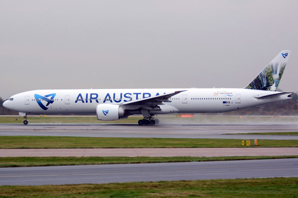
Now the first aircraft has been painted.
Copyright Photos: Nik French. Boeing 777-3Q8 ER F-ONOU (msn 35783) left a rainy Manchester today in the new look. The new livery features beautiful island images (below).
Air Austral aircraft slide show:
http://airlinersgallery.smugmug.com/Airlines-Africa-1/Airlines-Africa1-AF/Air-Austral
Video: “Air Austral Happy”:


Hey Bruce. I’m on WordPress now starting my own blog type thing. Might kick off might not let’s see but more on that another time.
On Air Austral: I don’t like it. Not just because it came to Manchester and I didn’t see but in my opinion it almost looks like a logo jet with it’s design. They’ve taken the large capital text idea from Aigle Azur and Air Corsica; and the idea of a photo on the tail from Frontier Airlines. Although it is a stunning photo. I love the new logo and as a graphic designer student I’m taught that a great logo is step one to showing you identity. But a cheap livery on an aircraft doesn’t give off a great first impression. A new livery is supposed to be a step up from the last one and show a newer look to the company. And that’s why I’m learning to love Iberia and China Eastern’s new colours; Spirit Airlines: maybe a few more months. But this isn’t a step further for Air Austral. Maybe if they combined the old logo with this new logo it will look better. What do you think?
Oliver
Thank you Oliver. Let me know if you need any help. I am always willing to help. You can contact me by e-mail.
The one thing we can bet on with liveries, most of the classic carriers (airlines that have been around for a while) will most likely try to simplify their scheme, i.e. reduce the amount of paint on the fuselages in order to reduce the labor costs to maintain the image and in many cases go to larger titles as they scream for attention and try to fill the blank fuselage space.
On the other hand, upstarts or new carriers are likely to take the bold and colorful way in order to get attention in the early years. Most airlines go through this cycle.
I myself, I like color and I like change (more things to talk about and report, and best of all, more subjects to photograph and collect). I loved the American change because it was finally a change since 1968. Many readers do not like change but I am OK with changes. As long as they keep it interesting I am here to record the changes.
All the best.
Bruce
I don’t know which is uglier, this livery or their older one.
Pingback: Air Austral paints its first aircraft in the new livery | feeds